Context
Credit unions had trusted member relationships but often lacked modern retirement-planning tools. Silvur had the product, but not the same institutional trust.
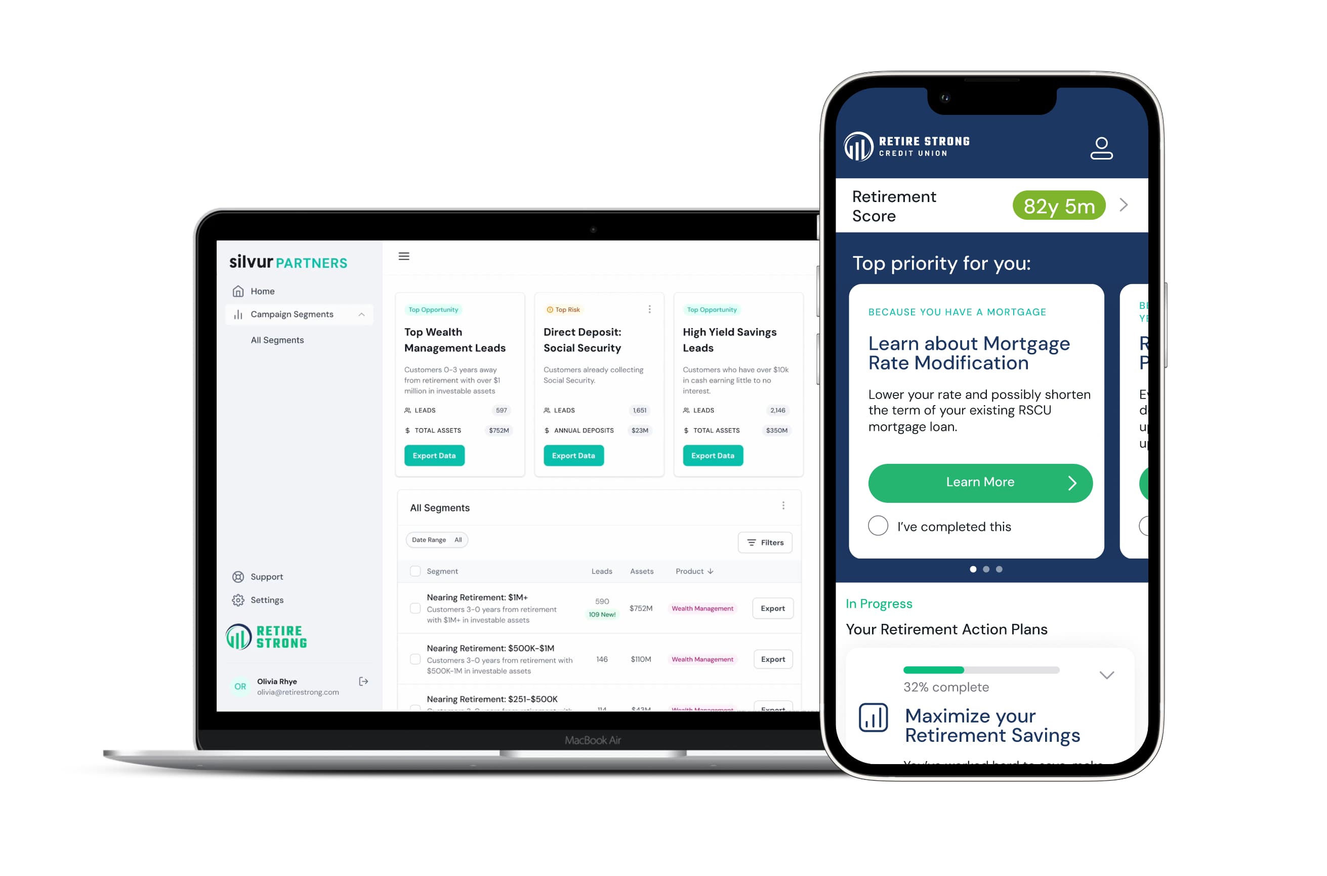
I designed a two-sided platform that let credit unions launch a branded member experience with minimal setup, then use member activity to identify timely ways to support their members.
Outcomes
10+ credit-union partners
Supported through one shared platform
500K+ member reach
Across participating credit unions
2–3× higher engagement
With contextual partner offers compared with generic placements
Two-thirds of surveyed members
Became more aware of services offered by their credit union
“Silvur is an unexpected bonus of being a member of my credit union.”
Role
As Director of Product Design, I led the member experience, white-label system, and partner dashboard. I worked with product, engineering, research, and credit-union teams to evolve Silvur from a consumer retirement product into a repeatable partner platform.
Combining complementary strengths
Retirement decisions require trust. Silvur offered specialized tools and guidance, but some users were hesitant to make long-term financial decisions through an unfamiliar startup.
Credit unions had the opposite problem. Members trusted them, but many had limited digital infrastructure and little visibility into the financial questions their members were beginning to ask.
The partnership connected those strengths:
Credit unions provided trust and access to members.
Silvur provided a modern retirement-planning experience.
Member activity revealed emerging financial needs.
Credit-union teams could use those signals to provide relevant guidance and services.
Designing for partners with limited technical capacity
The partnership model would not scale if every credit union required a custom implementation.
Many partners had small marketing and technology teams. Some had detailed brand standards; others could provide little more than a logo and two colors. A traditional white-label process would have introduced repeated design reviews, custom component work, and separate implementations for every launch.
The design question became:
How could each experience feel credibly connected to its institution without creating a different product for every partner?
Reducing onboarding to the essentials
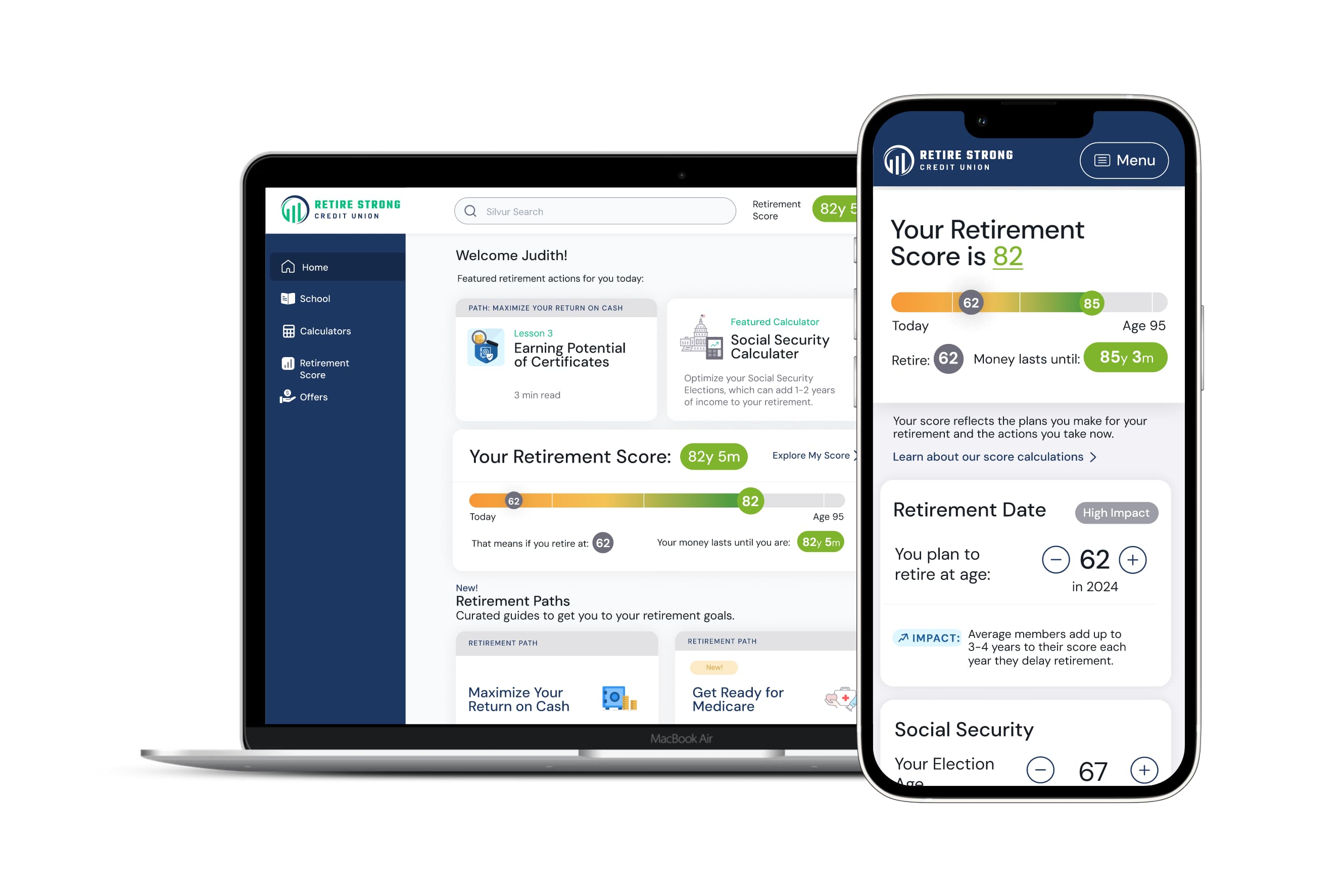
I designed a constrained theming system that could generate a complete partner experience from:
A credit-union logo
One primary color
One secondary color
The system mapped those inputs to defined roles for backgrounds, headlines, and calls to action.
The rest of the interface remained governed by the shared design system. Text, borders, cards, errors, status colors, and financial semantics used a neutral foundation that worked across every theme. Contrast checks and fallback rules prevented partner colors from compromising accessibility.
This created enough institutional recognition to support trust while keeping the product consistent and maintainable.
Interactive artifact: See how a logo and two colors become a complete, accessible member experience.
Turning member activity into partner value
Launching the member experience solved only one side of the partnership.
Credit unions also needed to understand whether Silvur was strengthening member relationships and where their teams could provide additional support. Their existing systems could show account balances and product holdings, but often could not reveal which financial decisions members were actively considering.
Within strict privacy boundaries, Silvur could see meaningful activity inside the product:
Topics members explored
Calculators they used
Financial information they chose to enter
Decisions they returned to over time
This gave credit unions a new view into emerging member needs.
The design challenge was not to produce more analytics. It was to help partner teams understand what the signals meant and what to do next.
Designing around decisions, not dashboards
Rather than organizing the experience around charts and engagement metrics, I structured it around campaign-ready opportunities.
Each opportunity answered three questions.
1. What need is emerging?
The dashboard surfaced groups such as:
Members approaching retirement with significant investable assets
Members at or beyond Social Security eligibility who had engaged with benefit-planning tools
Members reporting large cash balances earning little interest
These were framed as opportunities to support members, rather than as abstract behavioral segments.
2. Why were these members identified?
Each opportunity showed the on-platform behaviors behind it.
For a Social Security opportunity, teams could see how many members had:
Reached eligibility age
Entered expected benefit income
Used the Social Security calculator
This gave teams a clear view of what members were actively exploring.
3. How can the team respond?
The dashboard paired each opportunity with a recommended campaign and allowed teams to export the audience into their existing marketing tools.
We deliberately avoided building another campaign-management system. Silvur provided the insight and audience definition, then handed the workflow back to tools the teams already used.
Validating the value exchange
The partnership depended on more than placing a credit-union logo on the product. Members needed to experience Silvur as a meaningful benefit of their membership.
I used surveys, facilitated interviews, and open-ended feedback to understand whether that connection was visible.
Members connected Silvur’s value to their credit union
“Silvur is an unexpected bonus of being a member of NASA Credit Union. I like it very much.”
“I wish you had provided such a valuable service sooner! Very good benefit to your membership.”
The feedback suggested that the white-label experience created more than visual familiarity. Members understood that their credit union was providing access to the service.
The experience increased awareness of other services
Two-thirds of approximately 330 survey respondents said that using Silvur made them more aware of products and services offered by their credit union.
Members were receptive to relevant next steps
In interviews, members described the product as a natural place to connect them with additional guidance:
“This is an incredible value to get through my credit union.”
This supported the dashboard strategy. Recommendations could feel like a continuation of useful retirement guidance when they were timely, relevant, and grounded in a need the member had expressed.
Results and impact
A repeatable partner model
The shared design system supported more than 10 credit-union partners without requiring a separate product implementation for each institution.
Partners could launch a recognizable member experience using a small set of brand inputs, reducing the design and technical burden on their teams.
Greater access to retirement guidance
The partner model expanded Silvur’s potential reach to more than 500,000 credit-union members across participating institutions.
Members consistently described the experience as useful, understandable, and valuable to their credit-union membership.
New visibility into member needs
The dashboard gave credit unions behavioral insight they had not previously had, helping teams identify members exploring decisions related to Social Security, healthcare, savings, wealth management, and other retirement priorities.
A bridge from education to action
Contextual partner offers generated 2–3× higher engagement than generic placements. The system connected educational activity to relevant support while preserving a clear distinction between guidance and product promotion.
Lessons
White-labeling was not primarily a branding problem. It was a platform-design problem.
Too much customization would have fragmented the product and increased operational overhead. Too little would have weakened the institutional recognition that made the partnership valuable. The scalable solution was a constrained system that made each credit union recognizable while keeping the core experience shared.
The dashboard required a similar balance. Credit unions did not need more data. They needed enough context to recognize an emerging member need and a straightforward way to respond.
Together, the two systems connected trust, engagement, insight, and action.