Silvur

Context
Silvur began as a managed-assets product designed to help retirees turn savings into reliable income. When adoption remained limited, I led research combining funnel analysis, targeted interviews, and repeated onboarding studies to understand why.
The work confirmed that the product was asking for substantial trust too early, while uncovering a broader unmet need: people were struggling to connect decisions across income, spending, Social Security, healthcare, housing, and work.
I helped reframe the product around retirement decision support, giving users a clear view of where they stood, how different choices affected their outlook, and what they could do next.
Outcomes
120K+ users
Reached through the consumer retirement platform
7.5× higher engagement
After launching a guided retirement-education experience
4.5-star App Store rating
Reflecting strong user satisfaction and trust
“I cannot thank you enough for providing this one-stop location for retirement planning. Very, very helpful.”
Role
As Director of Product Design and the sole product designer, I led the product from early research and concept validation through end-to-end UX, visual design, and launch. I partnered with product and engineering to shape the roadmap, define hypotheses, and decide what we shipped.
Challenge
Retirement isn't one decision — and no tool connects the ones it is
For Americans 50+, retirement is a web of interconnected choices across finances, healthcare, housing, and lifestyle. The landscape they navigate it with is deeply fragmented: scattered advice across Google, PDFs, and advisors; hidden details behind paywalls and sales funnels; siloed services that never show how one decision impacts another.
Users were confused, overwhelmed, and hesitant to act — so they either delayed key decisions or paid high-cost advisors. For Silvur, that gap was the opportunity: become the trusted, go-to source for planning and unlock a massive, underserved market.
Our Hypothesis
If we created a transparent, interactive experience that helped users understand how retirement decisions interconnect, we could build confidence, drive engagement, and win a segment that feels overlooked.
Approach
Discovery: users kept re-opening decisions the industry called "done"
I led product discovery from the ground up — planning and running user interviews, synthesizing insights, and working with our PM to define hypotheses we could test with real users before we built. With engineering, I prototyped early to test feasibility and usability.
Initial MVPs explored financial milestones and lifestyle goals. Users kept asking a harder question:
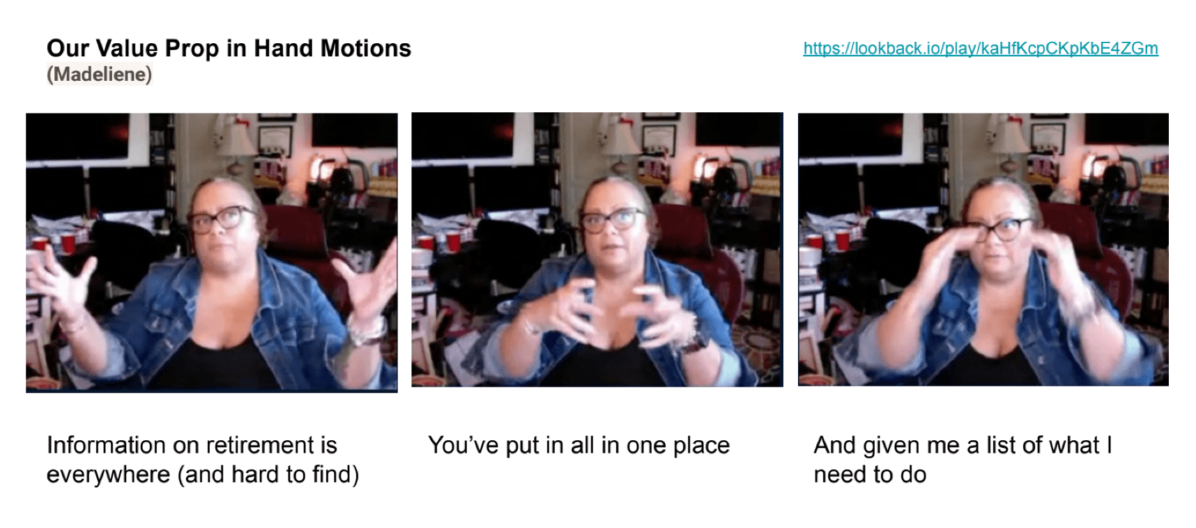
"How does this all fit together?"
Their decisions weren't a sequence. They were a web — financial, emotional, and logistical at once — and people revisited them every time life changed.
Users didn't want to see the complexity. They wanted the product to hold it for them and hand back simple next steps. The engine had to be connected so the guidance could be simple.
Finding the Hook: Retirement Score
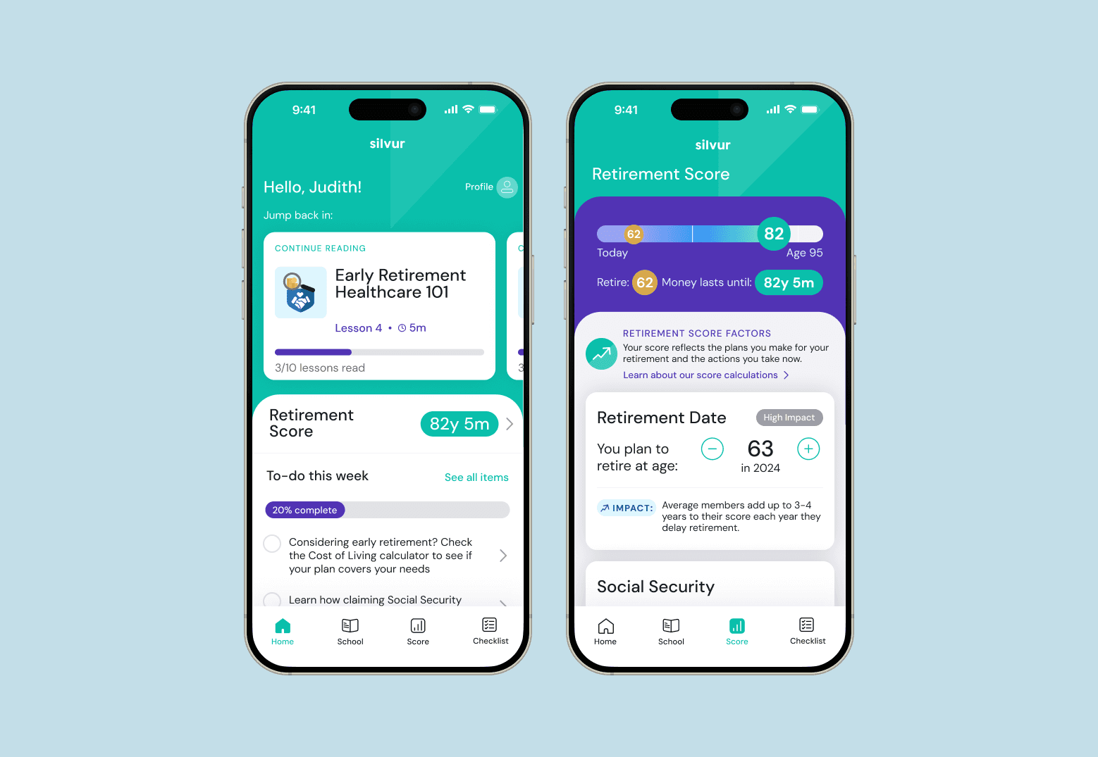
That insight led to our first breakthrough. The Retirement Score takes a few simple questions about a user's age and finances and turns them into a bird's-eye view: how long your money could last, and how each interconnected decision — retirement age, Social Security timing, spending — moves the outcome.
A working prototype of the Retirement Score. Adjust any assumption — retirement age, spending, Social Security — and see how one decision reshapes the whole picture.
This feature took a few simple questions about a user's age and financial situation and turned it into a simple tool that gave them a birds-eye view of the interconnected decisions that they might be making in retirement.
Tradeoff: We debated going deeper into simulations, but prioritized simplicity and clarity to reduce cognitive load.
Result: The top-performing feature in user surveys and the primary driver of downloads and early adoption.
And the re-opening behavior we saw in research became a feature, not a bug — the Score is built to come back to:
"[The Retirement Score] helps me see where I stand—like, okay, now I get where I’m at. Then I can dig in, learn more, make some decisions, and even come back and tweak things based on what I’ve learned."
Adding Ongoing Value: Retirement School
After proving we could drive adoption, we focused on increasing retention. I led a cross-functional ideation sprint to identify next-step features, then prototyped and tested two frontrunners:
Daily financial tracking tools (budgeting, saving)
Bite-sized educational content
User testing revealed that budgeting needs were already being met elsewhere, but educational content was the gap.
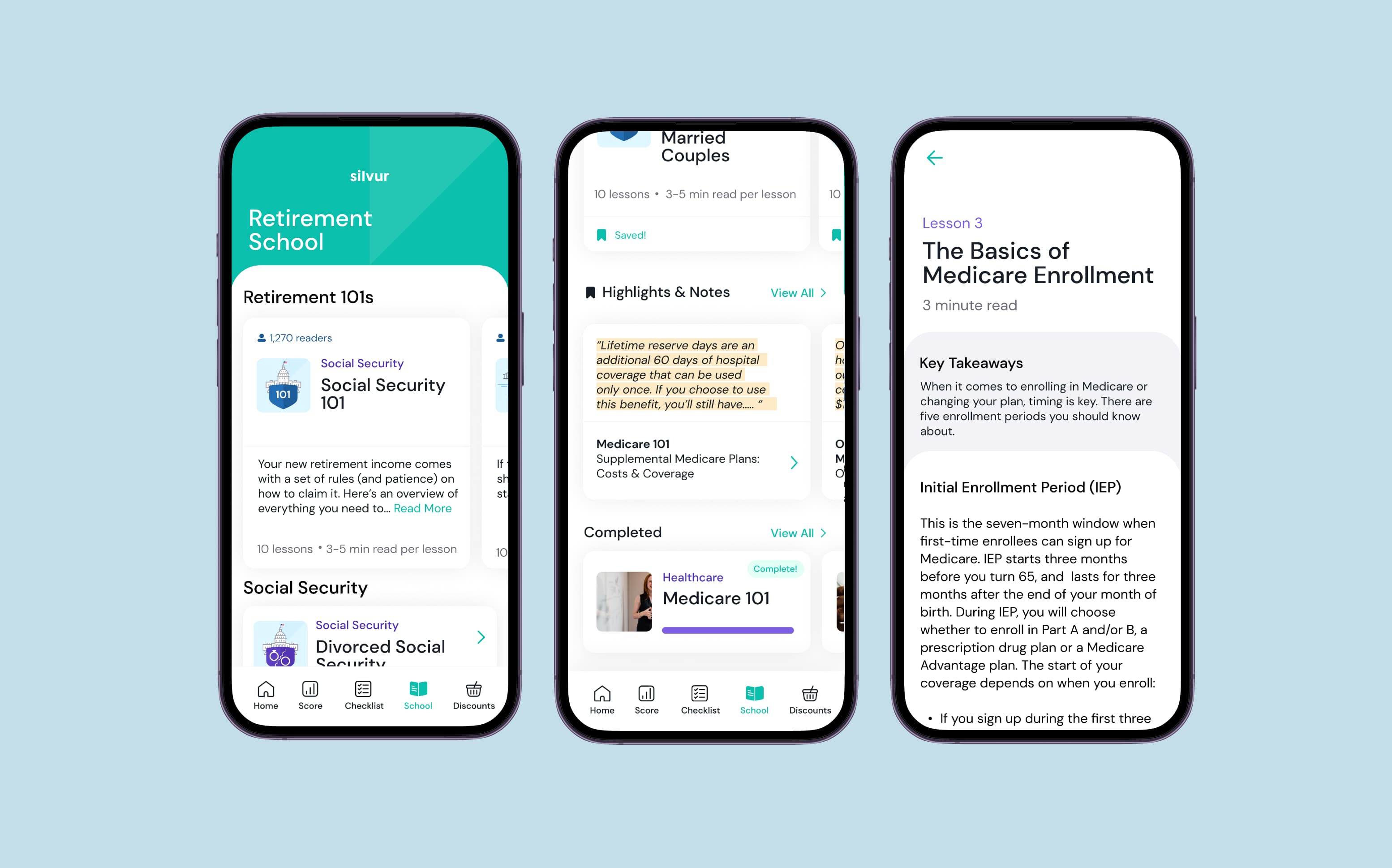
This lead us to build Retirement School—a library of short, digestible lessons optimized for mobile. We focused on clarity, readability, and key decision points like Medicare, Social Security, and 401(k) withdrawals. I led content design, UX, and interaction patterns, launching iteratively and optimizing based on engagement data.
Results and impact
120K+ users
4.5★ App Store rating — valued for clarity and ease of use
7.5x time spent in app — largely driven by Retirement School
3.5x sessions per month — users returning as life changes
Business Impact: Positioned the app as a trusted, integrated resource, helping users make informed, interconnected decisions about retirement.
"We’re financially savvy, yet we’ve learned so much from Silvur. It’s the most valuable free tool we’ve ever used, and it’s helping us make real changes to our retirement plan."
