Babytalk GPT
Outcomes
Launched in December 2024, the app saw early users engaging an average of 23.5 sessions per month. Post-launch interviews also indicated that its personalized content and conversational tone were connecting with the intended audience.
As one user described it: “It’s crazy how much this app hits the nail on the head every time.”
The project demonstrated how AI, user research, and a focused UX strategy could create a pregnancy experience that felt more relevant and personal to younger parents.
Role
As Head of Product Design, I led product discovery and UX strategy from early research and prototyping through final design. I partnered closely with the founder and head of engineering to define the MVP, shape the roadmap, and translate user needs into a differentiated AI-supported experience.
The Challenge
A new generation of parents entered pregnancy with expectations set by the products they already lived in: apps that learned their preferences, AI they could ask anything, feeds that adapted daily. Pregnancy apps, meanwhile, served everyone the same week-by-week content.
Our early research surfaced three recurring gaps:
Personalized in name only. Apps personalized by due date, then stopped. Participants handed over their circumstances — dietary restrictions, health conditions, twins, location — and got generic content anyway. One participant entered that she was having a boy, and her app's weekly updates called the baby "she" for nine months. "It should know me."
The mother was an afterthought. Fetal development was covered well, and genuinely loved. But her own experience wasn't: labor, body changes, relationships, and postpartum lived outside the apps, in books, birthing classes, and late-night searches. "It's telling me about my baby, but it's not telling me things I should or could be doing to help my body."
Assembly required — at an emotional cost. Participants ran multiple pregnancy apps alongside Google, Reddit, TikTok, and group texts to piece together answers, using only a sliver of each app. And open-ended searching often made things worse: anxious 2am questions returned worst-case scenarios instead of clarity. "I was probably going to Google every single day, multiple times a day."
Hypothesis: We believed a personalized, AI-supported experience, one that knew each user's circumstances and treated the mother's experience as fully as the baby's, could become the trusted first stop, replacing the patchwork of apps, searches, and forums parents were assembling on their own.
The Approach
We explored how a pregnancy app could feel more personal, approachable, and useful without making the AI experience feel overly complex. The work focused on building trust, reducing effort, and helping users understand what the product could do for them.
What we explored:
Multiple interaction styles: Early prototypes included structured tools such as planners, to-do lists, and comparison features. Testing suggested that users were more interested in simple interactions that produced useful, personalized responses than in managing another set of tools.
Approaches to trust: We tested different tones, interaction patterns, and levels of structure to understand what helped users feel comfortable discussing health, emotions, and lifestyle with an AI-powered product.
What we prioritized:
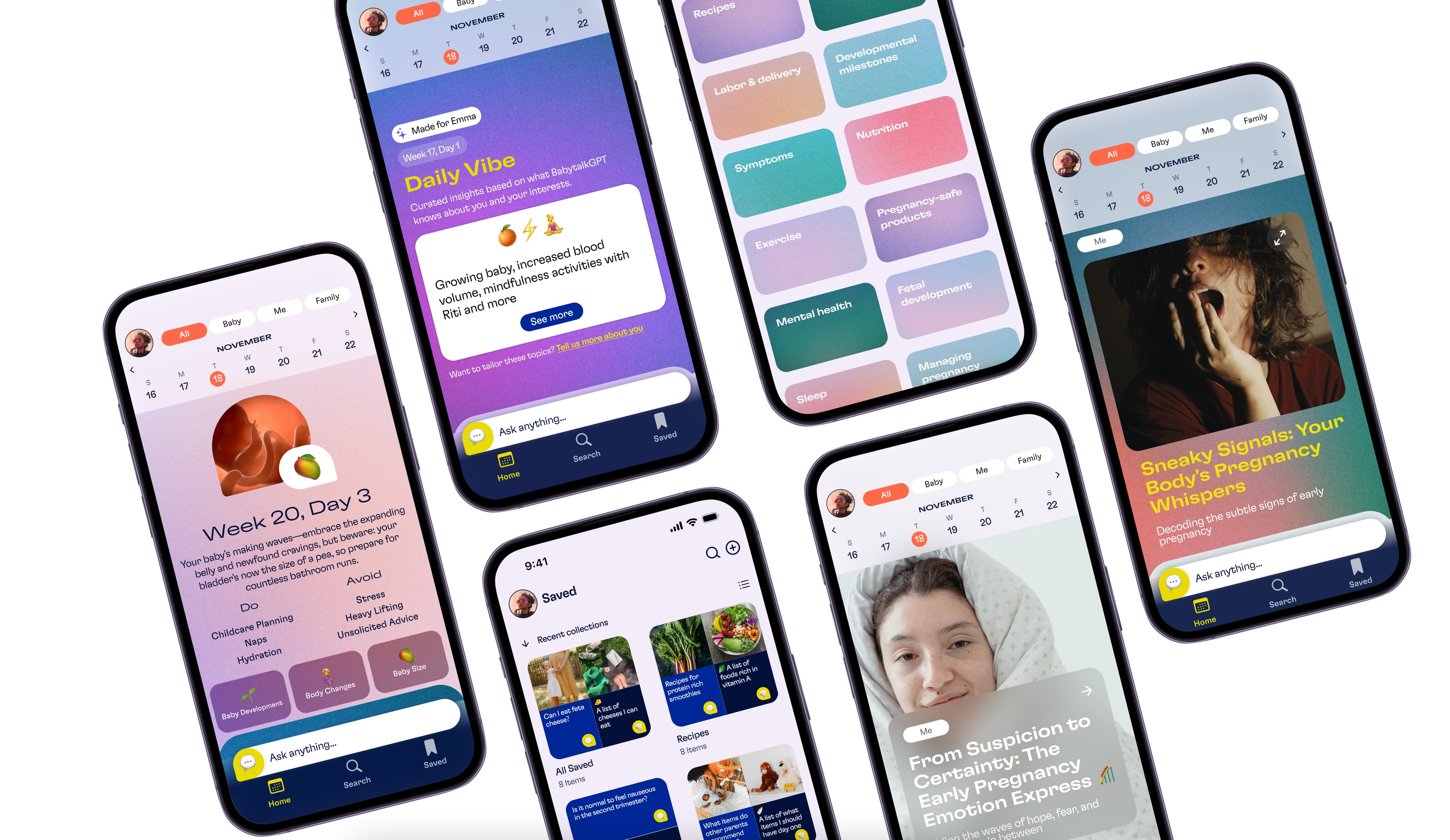
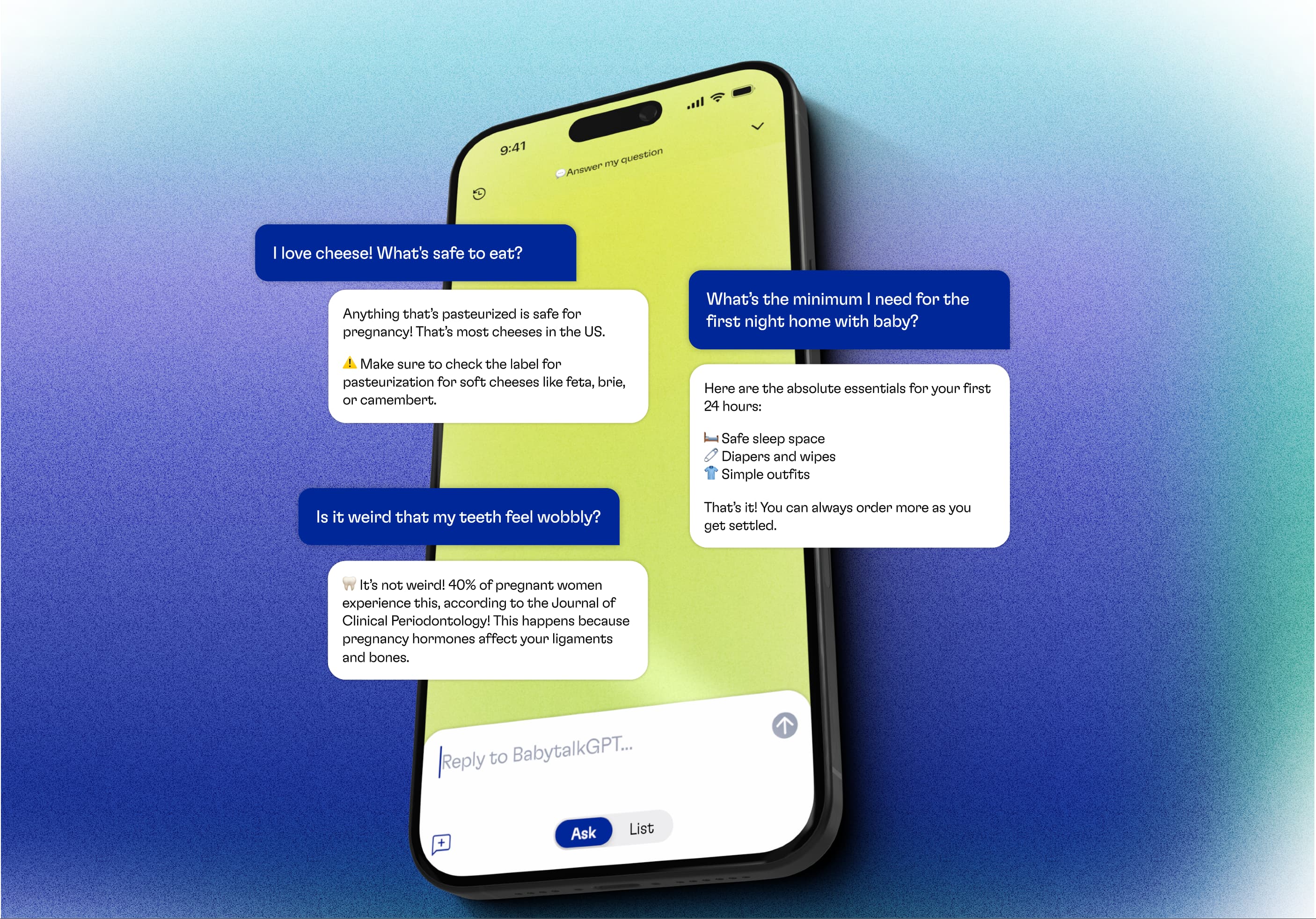
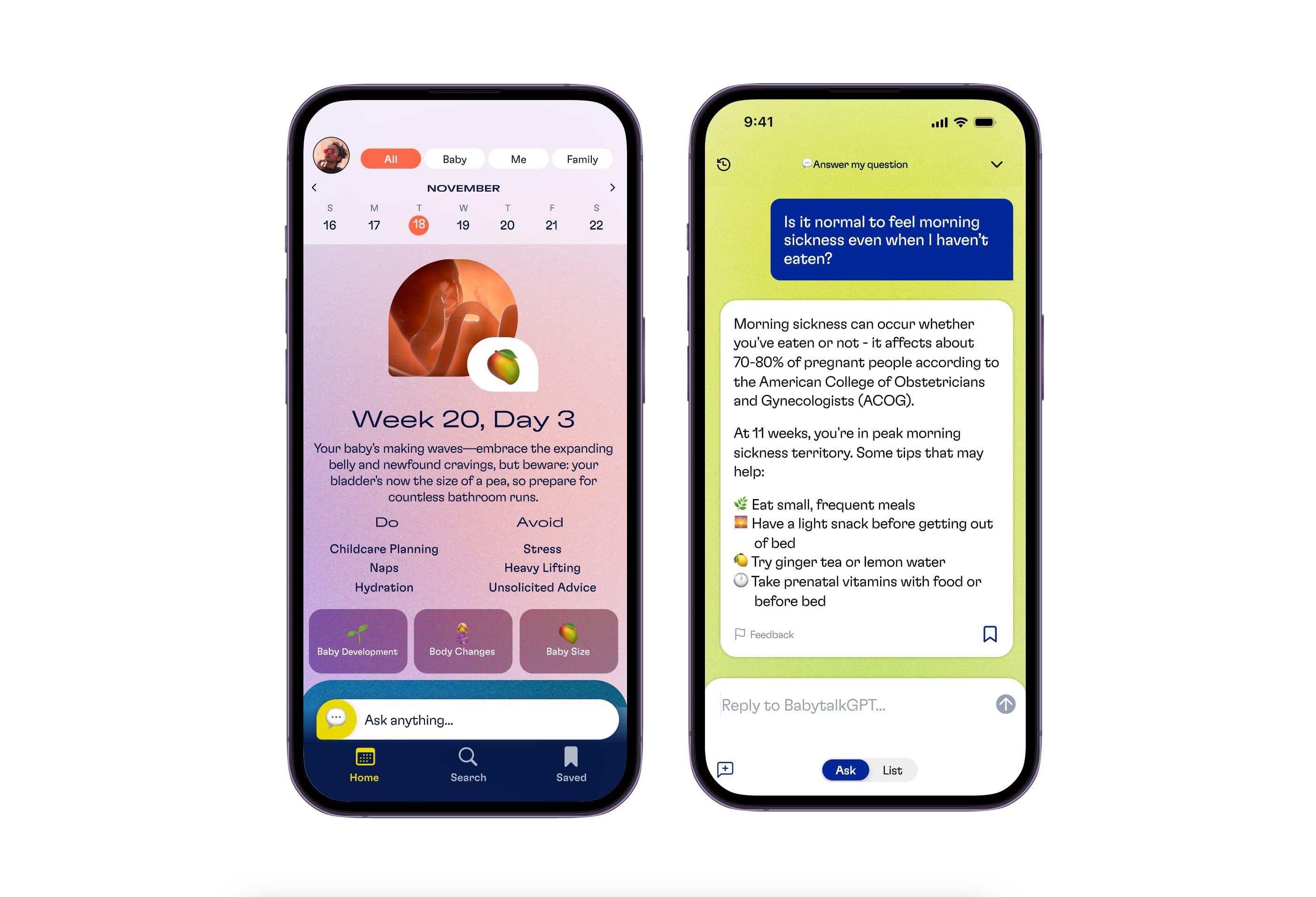
Simple inputs, personalized outputs:We reduced the experience to a small number of clear entry points. Users could ask a question directly or engage with personalized content and prompts based on their stage of pregnancy and profile.
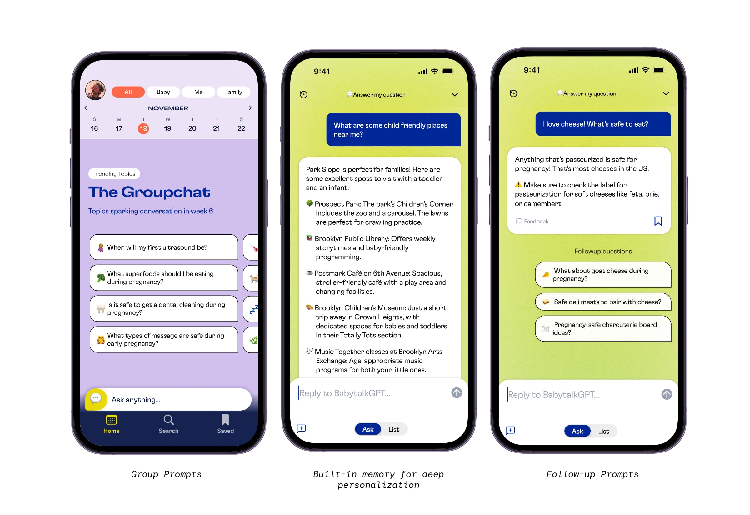
Layered engagement: The experience supported both passive and active use. Users could browse a feed and daily content, respond to personalized prompts, or explore a “Groupchat” featuring curated questions from other users.
Context carried across the experience: The product retained relevant details such as due date, family structure, and location so responses could become more specific over time.
Conversational onboarding: The product retained relevant details such as due date, family structure, and location so responses could become more specific over time.
A distinct visual and editorial direction: Bold color, expressive typography, and a more informal tone helped distinguish the app from more clinical or traditional pregnancy products. These decisions were tested with the intended audience rather than treated as assumptions about Gen Z preferences.
Throughout the project, I worked with the founder and head of engineering to balance user needs, product differentiation, and technical feasibility. I led research synthesis, prototyped and tested product concepts, and helped prioritize the features that would form the MVP.
Results and impact
We launched in December 2024 with a product that resonated deeply—both in metrics and in sentiment.
23.5 monthly sessions per returning user
43 minutes per returning user per month
50%+ retention in early cohorts
Validated resonance: In post-launch interviews, users frequently described the content as relevant and personally attuned:
“This app feels like it’s actually speaking to me.”
“It’s crazy how much this app hits the nail on the head every time.”
The launch supported our core hypothesis: users valued a pregnancy experience that combined personalized guidance, low-effort interaction, and support for both fetal development and their own changing needs.